We expanded our global reach, opening new offices in London, New York, Paris and Bangalore to strengthen our network and gain a better understanding of the local markets.
We more than quadrupled our employee headcount and brought on four new investment partners. And to date, we’ve invested in more than 110 tech start-ups across the world, over four funds – the last of which was $650m.
But our existing brand did not reflect this reality.
Our messaging no longer reflected the experiences our founders and employees have with our company. The colors and imagery didn’t express the vibrancy and creativity that exists within the firm and in the minds of the entrepreneurs we partner with. While the language we used didn’t align with our ways of working – nor how our portfolio founders seek to work with us. So we did something about it.
It was time for us to address the age-old question: what does RTP stand for?
The process
We took the time and did the work, led by the team at LoveGunn.
We thought about the entrepreneurs we partner with; their goals, their ambitions and their challenges. The team questioned our investment thesis and what we uniquely offer bright and ambitious founders who are building the next generation of category leading businesses. And we reflected on the most important question – why do we do all this?
Following these discussions, it was clear that our brand needed to be:
- Founder first. Everything we do – from our founding story to the way the fund is structured, from the way we deploy our capital and the decisions we make – is aligned with our portfolio founders’ ambitions.
- Bold, creative and visionary. We partner with entrepreneurs who are reimagining how the world works through technology, creating and building something unique or transformative.
- Empathetic to the entrepreneur’s journey. We acknowledge the highs and the lows that founders go through. We listen, ask the right questions and open up networks to provide long-term support on this challenging journey.
When we asked ourselves why we do this, we agreed that we want our founders to reach their full potential. And we acknowledged that we have the ability to see the potential early on. For example, we invested in tech companies like Datadog, Cred, and DeliveryHero at Series A. Today, they are multi-billion dollar companies.
So coming back to the original question, what does RTP stand for? It stands for Realizing True Potential.
And this is the narrative that runs through our brand – from our messaging to our identity. Let’s go into a little more detail.
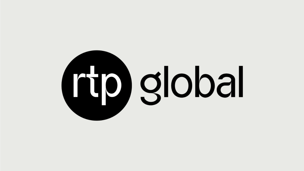
Our logo
Our heritage means a lot to our company so we didn’t want to completely move away from our original logo. It needed an update.
Our relationships with founders matter most and open lines of communication are at the heart of this. To bring this ethos to life, we have used the speech bubble device across our brand identity – including our logo. See how the shape of the bubble cuts into the ‘t’.


The ‘RTP’ is also housed in a circle – a nod to our global reach.
Our colors
Gone are the dark blues and muted grays that felt cold and formal.
Our new neutral color palette represents the slick, sophisticated and modern firm we are today. And it is brought to life with pops of color. The energy and brightness across our palette mirrors the ambitions of the founders we partner with – those with bold and creative ideas to solve big problems and reimagine how the world works through technology.
The shift from ‘corporate finance blue’ to this bold variety of colors also reflects who we are as a team; people with diverse backgrounds and ideas, who take bold bets, and who are aligned with creative entrepreneurs.
Our imagery
We position the founder up front and center, and surround them with the items that reflect the solutions they are creating. The moodboard or collage effect represents the creativity and the world they exist in.
As a result of this rebranding exercise, we can now clearly express who we are, what we stand for and what we offer to the pioneering entrepreneurs on their journey to build the next generation of truly outstanding companies.
The brand you see today accurately reflects the success stories of the past 23 years and paints a picture of the experiences we provide for founders, our partners and our team members.
But this is just the start.
Our new identity and messaging helps us grow as a firm and shape the experiences we create in the future. We look forward to bringing you with us on the next stage of our journey.

